Friday, April 27, 2007

Image Essay #15


While I was working on my final 2D project, I wanted to look up examples of work that could show an extreme foreground and background. In Thursday's critique, I discovered that I needed to understand how to make the images in the front of my DVD cover stand out in the foreground more dynamically.

I found this work of art by Sally Gall. I think it really helped me understand how I could make the foreground appear closer to the audience. The doors that are leading to the outside in this artwork show the wall from the inside which it is built onto. This is great because it shows the the viewer is looking at the Eiffle Tower from the inside of the building looking out. This shows that the background has more depth and is further away. This is also depicted because the details of the Eiffle Tower slowly diminish as you look farther back into the background. I think it is interesting how this is portrayed.

Also, in this work I thought it was interesting how the artist chose to make the perspective. She chose to show the tower, not from a central view, but from the view where the gate was opening. It really makes me feel like I am there looking out randomly into the scene.

This truly helped me understand that in order to make the foreground more dynamic, I will need to add thicker lines and make the scenes more detailed in order for it to pop out from the background and middle ground.

Image Essay #14


This work of art is done by Nicole Etienne. It is a great example of use of secondary colors. In this example, I chose to portray what it looks like to use the color orange. Etienne used red and yellow to create the orange that is used in this painting. What I enjoy about this example is on the fruit, you can see all of the colors that make up that certain shade of orange. I think it is brilliant that she made the fruit look so shapely and did so by using variations in the color.

The example of the pears is representational of the secondary color, green. The viewer can see that the green color is made up of yellow and blue. The highlights of color on the pear is of the color yellow, in different variations and shades. There is green around the pear, but where there are shadows near the table, you can see small amounts of blue, which make up the green. I think this work is also interesting to show how the color is contrasted with the primary colors it is made of.

I think these two examples show how artists can use the primary colors that are components of the secondary colors to accentuate the color that is trying to be portrayed.

IMAGE ESSAY #13


Value is the lightness or darkness of a color. In these examples, you can see that is evident.


This work by Kenneth Garrett shows a good example of value contrast. He uses different values of the color red in the sky to show the light from the sun, which is in the process of rising or setting. You can really get a sense of the relationship between the light and dark areas. The value in this piece is minimized, which means that the range of values creates a subtle effect. You can hardly tell where the colors change because it just blends right into a different value instantly.


This photograph is by Bill Romerhaus. Unlike the work above, this is in high-contrast. The values of blue in this work are very bold and you can tell that there are many different values between the white of the water in the tide to the dark blue of the water at the deepest point of the tide. The arrangement in the amount of variation in light and dark areas is known as the value pattern. In this work, it really gives the work of art a different emotional feeling. For example, you get an intense feeling of fear in this painting, because you get a sense of the wave crashing down. This is evident because of the light value of the blue. It gives the viewer a sense of motion that the wave is crashing down at an intense speed. If the white was not quite as bright, I do not think it would create such an emotional feeling in this piece.

IMAGE ESSAY #12

This work is done by Viky Brago-Mitchell. In this print, she uses primary colors to make the artwork visually appealing.

Primary colors are unique because they cannot be separated into another color. For this reason, I think it is interesting to work with them. By adding black into the primary color scheme, the primary colors seem to be in the foreground and popping out at you.


I enjoy how Brago-Mitchell warped the color images in the way that she did. It really gives the viewer a sense of movement in this piece. By using different shades of colors, such as blue...you get a rippling effect in the overall piece. It is interesting how the colors pop out when they are next to one another.


I wanted to show this work of art, as well. It is a painting done by Nadine Rippelmeyer. She used primary colors in this work, but in a different form. She used the blue and yellow to make the green ground, which is something the other painting did not necessarily do. By mixing the two primary colors and setting that as a base to the other primary colors, it really sets off the forest floor in this work.

This is an example of two ways you can use primary colors to make this technique stand out.

IMAGE ESSAY #11


This work of art is by Steve Thoms. I think this piece is VERY appealing to the eyes and is an above average example of how use of color can be effective in a work of art.
Thoms used bold reds and yellows to portray this work "Poppies". Seeing the bright yellow-orange of the sky really gives you a sense of depth in the sky (dealing with clouds and the sun). This beautiful sky in the background is set up against the bright red poppies that are growing on the bland-green grass. This technique really makes the flowers stand out, as well. The use of color for the trees in the upper left corner of the print is effective because it is a very dark green, which sets off the bold color of the sunlit sky.
The use of intermediate colors in this artwork is very effective. The yellow-orange and the red-orange in the painting offset each other and compliment nicely. It reminds me of the DVD that was shown in class of the Japanese women fighting in the park. The colors are very bold and appealing to the eye in this piece, just as well as in the movie that was viewed in class.

Image Essay #10


Point of View


I thought that David Winston's work titled "Solitude" was a great example of point of view. I believe that certain points of view are crucial in making works of art appealing to the viewer's eye.

I learned from working with the assignment "The Story of this Place". I realized that simply painting a scene from a normal standpoint was too boring and it would not be as dynamic and effective as if I were to paint it crooked or even from looking up. I chose looking at an angle of my situation. Since my scene was from an excited car situation, I wanted it to come off as being frantic and shaky. Which really surprised me is that I could really pull that effect off by simply changing the perspective of the artwork.

In the artwork I chose in this blog, I think he chose a great perspective for this artwork. It is evident that he wanted to show the tree in wintertime. However, instead of portraying a shot of the tree from the frontal view, he chose to get the fence in the way, too. The effect of the bending fence makes the tree seem farther away. The viewer gets a serene feeling of comfort in this piece. You can also get a sense of depth from the background because the details fade away.

Tuesday, April 3, 2007

Artist Blog: Gabhan O'Keeffe


Gabhan O'Keeffe is an architect. His completed projects include: Residences for Princess Gloria von Thurn und Taxis, Isabel Goldsmith, the Marquess of Cholmondeley, Bryan Ferry, William Hurt, and Nan Kempner. He is working on residences in the U.K. as of present.

His own designs are the major influence in his work as a decorator. In fact, O'Keeffe used his Knightsbridge home as a sort of fabric laboratory, trying out new patterns, color combinations and textures. Gabhan stated, "The one wonderful thing about textiles, particularly for people really interested in the past," he says, "is it really is possible to weave something today and see it the way an 18th century pair of eyes would see it."

I particularly enjoy his work for many reasons. I like how he expresses his interiors. I have noticed that he tends to work on interiors for homes, particularly in Europe. He uses contrasting colors and vibrant tones to accentuate certain aspects of a space. Although I think his work is very appealing, it does not look comfortable to me. I do not feel as though the rooms that he decorates are made to be comfortable. For the most part, I see them as being works of art and more luxurious, than anything.


(Some examples of his work)


IMAGE ESSAY #9


In Barbara Kruger's work titled, "You are a Captive Audience" (1963), she shows a great example of what we are working on in class, currently. Kruger creates artwork that used black, great, and white tones in a way that makes the audience feel a sense of depth and dramatics.
In order to have something stand out, I learned that you need to have higher contrasted colors to make it appear to be popping out. Therefore, I found that this piece of work demonstrated this technique in a beyond average way. The artist used text in her work (which I find to be a challenging concept because it makes the viewer believe a certain thought. I believe that artwork is something that can be perceived many ways; the viewer's aspect, and many other different opinions, the determinate being how they view life, what they see, etc. Therefore, I think she did a great job picking what type of text to use and how to arrange it in a way to overall set the mood of the piece of work, which I feel is hurtful, jagged, and shameful.
By using black in the background, Kruger made the objects that were highly contrasted stand out more to the viewer. This was a great technique. This work of art inspires how I could go about working on my project.

Tuesday, March 13, 2007

BLOG ASSIGNMENT #4---STORIES

Art:21


1. Important stories that are told today, which I have noticed, are tales of the war. Since there is a war currently taking place, and many peoples' elders have participated in a previous war, almost everyone can relate to these stories somehow. The stories that your grandfather will tell you about his experience in the war may just relate to you and give you a background on what someone you know may be experiencing in Irag right now.

2. I think some stories are told over others because they hold more meaning. If a story can be related down generations and it can be related directly today, I believe it has more chances of being passed down and retold. Others could be lost because they are too far out there. They could be fables that lead your mind astray or could be too bizarre.

3. The artists featured in 'Stories' use sketchbooks and journals in their artistic processes because it assists in their creative thinking. It gives them a visualization of what they want to convey. I believe that these sketchbooks are in fact, art. They may not be the 'finished product', but they are most certainly the steps that are the creative process leading to the masterpiece. That in itself, is artwork.

4. I was six years old. The sun was so bright that it was blinding my eyes. It was the type of brightness that if you stared at it too long, you'd be seeing spots and everything would have iredescent tones to it each time you blinked. I spend every day laying in the grass, playing with my dolls and drawing pictures of flowers and the clouds. I dream of becoming a so big that I can touch them. I feel so content when the sun's rays hit my face. The warmth makes me smile.


I was such a dreamer. I would look up at the sun and lose myself in the moment. I took pleasure in the beautiful things in life and would depict that in my drawings created from my notebook paper, crayons, and markers. I had such a vivid imagination. I had these impossible dreams of becoming something I could never be, but I would imagine it so well in my mind that I almost believed I could.

BLOG ASSIGNMENT #4----PLACE


ART:21


1. I think that a place defines us. No matter where you are from, I feel as though that place definitely has shaped you, whether it be the weather, language, culture, or people that surround you.


2. Richard Serra is influenced by the launching of ship, which he was around when he was a child. His massive artwork seems weightless, reflecting that experience. Sally Mann used her love for the south to take pictures of things that she loved and that felt close to her, due to its great history. Margaret Kilgallen and Barry McGee were inspired by folk art, which was the art that was depicted all around the area of which they lived. The art was on buildings and businesses nearby. Pepon Osorio was influenced by the place he lived and wanted to provoke change, only through his artwork. He was particularly traumatized by a barbershop.


3. I got a new sense of how place reflects in artists' work. I see a great connection between artists and where they live or grew up.


4. I feel most connected to Sally Mann. I think she is a phenominal photographer. She is very dedicated to her work and is connected to the south, much like I am. I love serene settings and love finding beauty in the simplest things.


5. Richard Serra uses the ship launching to inspire his work; this makes the scale of his art large, but seem so weightless when you view it. Sally Mann uses nature in her work and it definitely shows the same size and depiction when you see her work. Margaret Kilgallen and Barry McGee found beauty in grafitti, and their artwork is of folk art-inspiration, making their paintings much larger than one may think. Pepon Osorio creates overpowering space, probably because of his tramatizing experience at a barber shop.


6. When I was young, there were many places that intereferred with my spirit.

*Pond-beautiful
*Cedar Point-thrilling
*Bathroom-intimidating
*My hometown-comforting

*Treehouse-security

7. My hometown of Gibsonburg, OH. The objects that occupy it are friends, familiar faces, flowers, streets, grass, churches, and smiles. The textures were soft, comforting, round, and fuzzy. The lighting was mostly bright, because it always seemed to be sunny when I remember it. It was a bright and happy place to be.

Tuesday, February 27, 2007

Image Essay #8


A great use of gestalt would be in the artwork created by Romare Bearden titled The Prevalence of Ritual: Baptism in 1964. This artwork is based on the art of Cubism, where the subject matter is basically African-American. The fractured image shows baptism in this work. The pieces and figures that are depicted in this artwork are pieced together by using grouping of textures and different contrasts. The viewer can get a great sense of depth with the use of various textures in the piece. Bearden takes information and energy into a single image and then combines the various shapes to compose an entire scene.By using various contrasts by using high key and low key components of black, white, and gray tones, the artist gave the viewer a sense of depth. The background has more black tones to create the illusion of an image that is further away from you. He uses more shade, which represents more black than white. There is a significant value pattern that is used within this artwork, where white, gray, and black are arranged in variations in light and dark areas. By using the visually emphasized techniques that he chose, the high value contrast definitely bring the front images closer to you, while the lesser contrast stayed back, which is represented as the background of the artwork.

Image Essay #7


A great example of a piece of work that has a distinct example of a focal point is Joseph Mallord William Turner’s Snowstorm: Hannibal and His Army Crossing the Alps. This artwork is a great example of how the artist uses many different techniques to guide the viewer’s eyes to the focal point of the work, which is essentially the blinding light from the ominous sun. Turner uses a rich overlay of historical motifs to set the feel for his work. At the lower part of this painting, Hannibal is leading his troops across the Alps to launch a surprise attack on the Germans. Although this is the part of history that the artist chooses to convey, it is surprising that your eyes do not directly go there. However, your vision is directed towards the bright orange sun that is peering through the hazy, gloomy skies that the battle has created. The cataclysmic forces of nature are being displayed using gray, black, and white. This creates various types of contrast in the background that direct your eye around the scene. I would like to bring back the use of dominant, subordinate, and accentual figures. In this piece, this technique is used as well, in order to bring focus on the focal point. For instance, Hannibal (bottom of painting) is barely noticeable, reduced to a speck on an elephant in the background.

Image Essay #6


William Claesz Heda’s Still Life is a beyond average example of the term, “synesthesia”. The best way to describe this is when one sense makes you feel another. In this example, images and how they are portrayed make you feel an entirely new approach to what is stereotypically rendered about the images. In this painting, food is viewed upon as a luxury item. Heda uses crystal goblets, glasses of different sizes, silver dishes, and traditional images and details that give the feeling of luxury---chosen for their contrasting shapes, colors, and textures. William Claesz Heda used analogous colors in this painting. Perhaps by using colors that were so close on the color wheel, he did not wish to have contrast in the visual colors of the piece, but rather contrast in the shapes and textures of the objects conveyed. For instance, the objects were painted as if the person whom was at the table was suddenly forced to leave. The broken glass indicates an upheaval on a narrative level. The entire artwork represents a curtain that time has just lowered on the scene that gives the objects a strange pathos. The unstable composition of objects that have implied feelings to human senses create the sense of a hasty departure, suggesting transience. While white wine, sweet lemons, slimy oysters, and pepper in a cone give one the applied feeling that is almost stereotyped into these objects, the overall composition of the painting give you an entirely different feel of the senses.

Image Essay #5


Man Ray’s work, The Gift, is a great example of iconography. Many icons, labels, or logos give you an image and you are likely to associate with what it means in every day society. For instance, many figures, shapes, and objects fit stereotypes of how they should be and what they stand for. In this piece, the viewer is deceived; the image takes on an entirely different approach to an iron.I have noticed that surrealistic artworks are fetishistic objects, mysterious poetic things that were found and created, and had no narrative. I feel as though they jolt the unconscious and spawned infinite associations, often sexual and violent. In this artwork, the viewer sees a clothing iron. However, the artist glued tacks onto the flat side of it, creating a new dimension to the stereotypical iron, known for ironing clothing in the home. It is a dislocation of both a household item and hardware that creates something unidentifiable, without logic or narrative, but filled with innuendoes of violence, pain, and sex. I feel as though this art is a beyond average example of how artists can change the misconceived meanings of certain objects into a new meaning, by simply adding a few tweaks. It is no longer just an iron used to steam and remove wrinkles in clothing; it is now a weapon, an object of lust, pain, or violence.

Image Essay #4


A piece that exhibits a great example of maximum dominance is Ellsworth Kelly’s Red Blue Green. Kelly plays a rectangle and a blue curved shape off of what appears to be a green ground. The left side of the piece appears fixed in position, whereas the right side of the artwork has movement. This could be due to the curved shape against the green “ground”, so to say. Kelly exhumes a great intensity of color in this piece of work on a large scale. This draws the viewer’s eyes to the dramatic shapes. Since the shapes are shown in such a way that the edge of the shape goes directly off the page, there is a sense of a large, dominant structure. So dominant, in fact, that it leads your eyes directly off of the page, leaving the viewer unaware of exactly how large the image is stretched off of the canvas. The combination of color and movement make this piece stand out. It appears that Kelly observed the world around him, especially the negative space. By using primary and secondary colors in this color scheme, the viewer gets a simplistic look at how dominance can play a role in moving your eyes in a piece of artwork.

Image Essay #3


In Kazimir Malevich’s work titled, “Suprematist Composition: Airplane Flying”, it is quite clear that the artist uses the dominant, subordinate, and accentual shapes to draw in his viewer. This technique keeps the viewer’s eyes moving throughout the artwork. The dominant structure in this painting is the largest black rectangle towards the center of the page. As one can notice, the smaller objects (compared to the large, dominant rectangle) are positioned near this “dump truck” to show the contrast in size. The subordinate shape in this piece is the yellow block that is located towards the top, which is cutting into the red rectangle. This shows that the yellow rectangle is quite larger than the red rectangle by breaking up the shape directly in the center. The accentual shape in this artwork is the smallest block located directly next to the largest, most dominant figure, which is the large black rectangle. By placing the smallest, most accentual shape next to the dominant figure, it shows exactly how large the dominant structure is compared to the smallest. Malevich uses primary colors in addition to black to create movement and floating throughout the artwork. The use of dominant, accentual, and subordinate shapes also contributes to this asset of his work. Color, size, and shape produce a unique rhythm against the white background of this painting. The edges seem hard and geometric, but when viewed closely, the boundaries waver ever so slightly. This painting is a great example of how the use of color, dominant, subordinate, and accentual shapes can lead the viewer’s eyes all around the artwork.

Image Essay #2


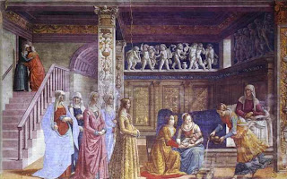
A technique used by Domenico Ghirlandaio in The Birth of the Virgin is the triangular hierarchy. Much like the term hierarchy itself, triangular hierarchy stresses the importance of figures indicated by size or location in the artwork. In this particular painting, Ghirlandaio uses the shape of a triangle in his piece to depict, essentially, the most important figure. He does a great job of doing this by painting two figures consoling one another at the top left of the painting. As one may notice, these characters are not standing out in the art, rather guiding your eyes down to the other point of the triangle, where the painter placed the most important figure in the piece. In the background, there are intricate statues of angels up above the figures. The colors used outside of this invisible “triangle” are bland, taking your eye to the main focus of this piece of art.The central figure is Ludovica Tornabuoni, the daughter of the patron. She is the figure with the most status, so all of the events and people leading up to her make her stand out just that much more. The members of the Tornabuoni family are descending towards her figure, guiding the viewer’s eyes directly to Ludovica.

Image Essay #1


In Pietro Perugino’s work, titled “The Delivery of the Keys”, there is a strong sense of hierarchy. Perugino used the hieratic scale to create his work in this particular piece. The artist uses a technique in which the importance of figures is indicated by the size and where they are located in the work of art.In this piece, Perugino places the most important figures in the front center of the piece. They appear larger and closer to the viewer than the objects in the background. For instance, the authority of St. Peter as the first pope, as well as all of those who followed him, rests as having received the keys to the Kingdom of Heaven from Christ himself. Therefore, the characters that are being represented in this piece most diligently are the ones who play out in the central narrative of this painting.While the entire painting is used in a mathematically exact perspective, it shows spatial clarity and a great sense of distance within the piece. Perugino used a great deal of symmetry in this painting, showing depth and clarity. On the left side, there is the story of Tribute Money. To the left of this piece is the attempted stoning of Christ. The images in these two separate stories are presented as less dominant, because they are fixated at a greater distance from the viewer, while the viewer focuses their attention on the scene of Christ delivering the keys.

Sunday, February 4, 2007

Writing Assesment

1. Before this Blog Assignment, had you ever kept a journal, diary, or blog? Yes
2. Before this Blog Assignment, had you ever written about art before? Often
3. Have you ever written for fun (poetry, fiction or non, journalistic, or research)? Extensively
4. When writing, do you use a dictionary or thesaurus? Both
5. If given a chance, would you rather discuss art verbally or through written means? Verbally
6. How would you rate your overall vocabulary? Above Average

7. How would you rate your vocabulary of art terminology? Average
8. How would you rate your writing abilities? Confident
9. How would you rate your writing abilities when writing about art? Average
10. How would you rate your ability to use specific vocabulary when writing? Average

Friday, January 26, 2007

Reviewing Part III

The juxtaposed images relate to one another in various ways. In the projects, I discovered that the images were arranged in a concept, which is a general idea derived from something that is formed in the mind.

The way the images are displayed on the page gives the viewer a different vibe. For instance, there must be dominant, subordinate, and accentual pieces on the work of art in order to draw the viewer into the work and keep them interested. The dominant image is the largest. This draws the viewer's attention directly, since it is the largest and most blunt object in the art form. The subordinate is the size that is smaller than the dominate, yet is still keeping the viewer's attention. The accentual piece is to make the viewer understand how drastic and dramatic the sizes of the dominant and accentual images are. It is very important to make sure that the images do not guide the viewer's eyes off the page, rather keep the eyes fixated on the work, freely moving and viewing all of the juxtaposed images.

Negative space is the area between two objects. While placing the images in certain spots, I was concentrating on the negative space, making sure that there was a dominant negative space in my work, along with smaller negative space, while still allowing the eyes to move throughout the work.

A certain theme went through my mind when thinking of the images for this portion of Part III. I wanted to convey a message about the war. I decided to make the dominant structure something big and dramatic, holding a great deal of meaning to the message. I chose a bomb for this because they are so dominant, powerful, and exactly what everyone thinks of when they hear "war". I chose the phrase, "War doesn't make boys men, it makes men dead" because it accentuated how I felt about this topic and I chose to show this image five times throughout the piece. For my accentual image, I chose the Pulitzer Prize-winning photo of a boy being shot at Vietnam. I decided I wanted this image to be dramatically smaller than the bomb because the issue of men dying and innocent civilians being killed does not go through people's minds quite as boldly as the BOMB. Also, the accentual image (the photo) made the viewer's eyes more drawn in to the larger image because it showed the drastic size difference. The message was quite clear in this piece.

Thursday, January 11, 2007

Biographical Statement

I absolutely love art. I have been creative, producing artwork since I was a little girl. I was sketching intricate details into my drawings while all of the other students were making stick people. Art was something that I could do to get away; something that I did not have to share with anyone. Afterall, having a twin sister really seemed to frustrate my space, so this was something where I could take on my own identity.
Ever since I could recall, my brain never necessarily operated in an organized, "mathematical" way, shall i say. I have always thought outside of the box and I love creating original ideas and art that is unique to me.
In high school, I took all of the art classes that were available for me. However, the school's committee was not too concerned about exploring art and making those classes available for the students. I took independent studies in my art classes because I was so fascinated with creating artwork. I would spend my study halls in the art room working with clay, charcoal, pencils, yarn, and paint.
I decided to take art classes at a community college close to my home when I was still in high school so that I could get my feet wet. I discovered how much I would love to carry this on as a profession someday. I learned a great deal from my instructor, such as how to handle criticism and many techniques of drawing. Overall, I think this experienced genuinely made me realize that art was something that I could see myself doing for a long time.
I believe that everyone has their own individual perception of art. So, I do not believe that there is one set definition for the term. However, I believe that it has a lot to do with self-expression. Therefore, I do believe that movies are art, along with music, video games, comics, and television. They are all outlets for one's creativity.
A main source that inspires me to create art is the love I have for other people. Slightly cliche, right? The person I am in love with has the most distinctive beautiful features that I love drawing, which gives me incentive to see things in others in a different light. I think that the deep feelings that I feel give way through my artwork, portraying images and features in such a way that others may not necessarily see them. I feel as though this feeling is applied to everyone, but they choose to use music or movies as their creative outlet.
Although this movie was not made in the past year, I think that Eternal Sunshine of the Spotless Mind was an amazing film. It came out in 2004, but I continue to watch it all of the time. I think that the director did an incredible job. The lighting was interesting and a lot of small details were changed throughout the movie. I believe this movie was the most creative film that I have seen in a while. It gave the audience a sense of a dream-like state, which I found appealing. The viewer sees an entirely different side of the actresses and actors that are playing these characters. That is why I think this movie is a great form of art.
I love the art of music. I enjoy music that creatively expresses true feelings. I am into Godspeed you! black emperor; this band is really instrumental, placing sound effects and speeches into each track. The songs are lengthy, but I adore that, because you can enjoy the state of mind that you are in that much longer. I enjoy the music of Rilo Kiley and Andrew Bird, as well. I really appreciate jazz/folk/blues music and believe that there is a lot of emotion in that kind of musical expression.
I am looking forward to seeing how everyone else perceives art and learning new ways of expression in this class. I am an interior design major and I believe that with my artistic ablility and creative thinking, I could go a long way in this field. I especially believe that a sense of art will better me in this profession.