Tuesday, February 27, 2007

Image Essay #8


A great use of gestalt would be in the artwork created by Romare Bearden titled The Prevalence of Ritual: Baptism in 1964. This artwork is based on the art of Cubism, where the subject matter is basically African-American. The fractured image shows baptism in this work. The pieces and figures that are depicted in this artwork are pieced together by using grouping of textures and different contrasts. The viewer can get a great sense of depth with the use of various textures in the piece. Bearden takes information and energy into a single image and then combines the various shapes to compose an entire scene.By using various contrasts by using high key and low key components of black, white, and gray tones, the artist gave the viewer a sense of depth. The background has more black tones to create the illusion of an image that is further away from you. He uses more shade, which represents more black than white. There is a significant value pattern that is used within this artwork, where white, gray, and black are arranged in variations in light and dark areas. By using the visually emphasized techniques that he chose, the high value contrast definitely bring the front images closer to you, while the lesser contrast stayed back, which is represented as the background of the artwork.

Image Essay #7


A great example of a piece of work that has a distinct example of a focal point is Joseph Mallord William Turner’s Snowstorm: Hannibal and His Army Crossing the Alps. This artwork is a great example of how the artist uses many different techniques to guide the viewer’s eyes to the focal point of the work, which is essentially the blinding light from the ominous sun. Turner uses a rich overlay of historical motifs to set the feel for his work. At the lower part of this painting, Hannibal is leading his troops across the Alps to launch a surprise attack on the Germans. Although this is the part of history that the artist chooses to convey, it is surprising that your eyes do not directly go there. However, your vision is directed towards the bright orange sun that is peering through the hazy, gloomy skies that the battle has created. The cataclysmic forces of nature are being displayed using gray, black, and white. This creates various types of contrast in the background that direct your eye around the scene. I would like to bring back the use of dominant, subordinate, and accentual figures. In this piece, this technique is used as well, in order to bring focus on the focal point. For instance, Hannibal (bottom of painting) is barely noticeable, reduced to a speck on an elephant in the background.

Image Essay #6


William Claesz Heda’s Still Life is a beyond average example of the term, “synesthesia”. The best way to describe this is when one sense makes you feel another. In this example, images and how they are portrayed make you feel an entirely new approach to what is stereotypically rendered about the images. In this painting, food is viewed upon as a luxury item. Heda uses crystal goblets, glasses of different sizes, silver dishes, and traditional images and details that give the feeling of luxury---chosen for their contrasting shapes, colors, and textures. William Claesz Heda used analogous colors in this painting. Perhaps by using colors that were so close on the color wheel, he did not wish to have contrast in the visual colors of the piece, but rather contrast in the shapes and textures of the objects conveyed. For instance, the objects were painted as if the person whom was at the table was suddenly forced to leave. The broken glass indicates an upheaval on a narrative level. The entire artwork represents a curtain that time has just lowered on the scene that gives the objects a strange pathos. The unstable composition of objects that have implied feelings to human senses create the sense of a hasty departure, suggesting transience. While white wine, sweet lemons, slimy oysters, and pepper in a cone give one the applied feeling that is almost stereotyped into these objects, the overall composition of the painting give you an entirely different feel of the senses.

Image Essay #5


Man Ray’s work, The Gift, is a great example of iconography. Many icons, labels, or logos give you an image and you are likely to associate with what it means in every day society. For instance, many figures, shapes, and objects fit stereotypes of how they should be and what they stand for. In this piece, the viewer is deceived; the image takes on an entirely different approach to an iron.I have noticed that surrealistic artworks are fetishistic objects, mysterious poetic things that were found and created, and had no narrative. I feel as though they jolt the unconscious and spawned infinite associations, often sexual and violent. In this artwork, the viewer sees a clothing iron. However, the artist glued tacks onto the flat side of it, creating a new dimension to the stereotypical iron, known for ironing clothing in the home. It is a dislocation of both a household item and hardware that creates something unidentifiable, without logic or narrative, but filled with innuendoes of violence, pain, and sex. I feel as though this art is a beyond average example of how artists can change the misconceived meanings of certain objects into a new meaning, by simply adding a few tweaks. It is no longer just an iron used to steam and remove wrinkles in clothing; it is now a weapon, an object of lust, pain, or violence.

Image Essay #4


A piece that exhibits a great example of maximum dominance is Ellsworth Kelly’s Red Blue Green. Kelly plays a rectangle and a blue curved shape off of what appears to be a green ground. The left side of the piece appears fixed in position, whereas the right side of the artwork has movement. This could be due to the curved shape against the green “ground”, so to say. Kelly exhumes a great intensity of color in this piece of work on a large scale. This draws the viewer’s eyes to the dramatic shapes. Since the shapes are shown in such a way that the edge of the shape goes directly off the page, there is a sense of a large, dominant structure. So dominant, in fact, that it leads your eyes directly off of the page, leaving the viewer unaware of exactly how large the image is stretched off of the canvas. The combination of color and movement make this piece stand out. It appears that Kelly observed the world around him, especially the negative space. By using primary and secondary colors in this color scheme, the viewer gets a simplistic look at how dominance can play a role in moving your eyes in a piece of artwork.

Image Essay #3


In Kazimir Malevich’s work titled, “Suprematist Composition: Airplane Flying”, it is quite clear that the artist uses the dominant, subordinate, and accentual shapes to draw in his viewer. This technique keeps the viewer’s eyes moving throughout the artwork. The dominant structure in this painting is the largest black rectangle towards the center of the page. As one can notice, the smaller objects (compared to the large, dominant rectangle) are positioned near this “dump truck” to show the contrast in size. The subordinate shape in this piece is the yellow block that is located towards the top, which is cutting into the red rectangle. This shows that the yellow rectangle is quite larger than the red rectangle by breaking up the shape directly in the center. The accentual shape in this artwork is the smallest block located directly next to the largest, most dominant figure, which is the large black rectangle. By placing the smallest, most accentual shape next to the dominant figure, it shows exactly how large the dominant structure is compared to the smallest. Malevich uses primary colors in addition to black to create movement and floating throughout the artwork. The use of dominant, accentual, and subordinate shapes also contributes to this asset of his work. Color, size, and shape produce a unique rhythm against the white background of this painting. The edges seem hard and geometric, but when viewed closely, the boundaries waver ever so slightly. This painting is a great example of how the use of color, dominant, subordinate, and accentual shapes can lead the viewer’s eyes all around the artwork.

Image Essay #2


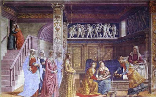
A technique used by Domenico Ghirlandaio in The Birth of the Virgin is the triangular hierarchy. Much like the term hierarchy itself, triangular hierarchy stresses the importance of figures indicated by size or location in the artwork. In this particular painting, Ghirlandaio uses the shape of a triangle in his piece to depict, essentially, the most important figure. He does a great job of doing this by painting two figures consoling one another at the top left of the painting. As one may notice, these characters are not standing out in the art, rather guiding your eyes down to the other point of the triangle, where the painter placed the most important figure in the piece. In the background, there are intricate statues of angels up above the figures. The colors used outside of this invisible “triangle” are bland, taking your eye to the main focus of this piece of art.The central figure is Ludovica Tornabuoni, the daughter of the patron. She is the figure with the most status, so all of the events and people leading up to her make her stand out just that much more. The members of the Tornabuoni family are descending towards her figure, guiding the viewer’s eyes directly to Ludovica.

Image Essay #1


In Pietro Perugino’s work, titled “The Delivery of the Keys”, there is a strong sense of hierarchy. Perugino used the hieratic scale to create his work in this particular piece. The artist uses a technique in which the importance of figures is indicated by the size and where they are located in the work of art.In this piece, Perugino places the most important figures in the front center of the piece. They appear larger and closer to the viewer than the objects in the background. For instance, the authority of St. Peter as the first pope, as well as all of those who followed him, rests as having received the keys to the Kingdom of Heaven from Christ himself. Therefore, the characters that are being represented in this piece most diligently are the ones who play out in the central narrative of this painting.While the entire painting is used in a mathematically exact perspective, it shows spatial clarity and a great sense of distance within the piece. Perugino used a great deal of symmetry in this painting, showing depth and clarity. On the left side, there is the story of Tribute Money. To the left of this piece is the attempted stoning of Christ. The images in these two separate stories are presented as less dominant, because they are fixated at a greater distance from the viewer, while the viewer focuses their attention on the scene of Christ delivering the keys.

Sunday, February 4, 2007

Writing Assesment

1. Before this Blog Assignment, had you ever kept a journal, diary, or blog? Yes
2. Before this Blog Assignment, had you ever written about art before? Often
3. Have you ever written for fun (poetry, fiction or non, journalistic, or research)? Extensively
4. When writing, do you use a dictionary or thesaurus? Both
5. If given a chance, would you rather discuss art verbally or through written means? Verbally
6. How would you rate your overall vocabulary? Above Average

7. How would you rate your vocabulary of art terminology? Average
8. How would you rate your writing abilities? Confident
9. How would you rate your writing abilities when writing about art? Average
10. How would you rate your ability to use specific vocabulary when writing? Average